New York City Launches Inclusive World Cup Tourism Campaign
New York City's Mayor's Office has launched a citywide tourism campaign for the World Cup, designed by 34-year-old creative director Arsh Raziuddin. The campaign aims to generate excitement among New Yorkers and tourists while promoting inclusivity through various initiatives like free public watch parties and partnerships with local businesses. Its visual identity incorporates nostalgic elements, beloved city colors, and symbols, reflecting the administration's focus on community and accessible design.
New York City's Mayor's Office has launched a new tourism campaign to build excitement for the upcoming World Cup, targeting 8.5 million New Yorkers and 1.2 million tourists. The campaign's visual identity was developed by creative director Arsh Raziuddin, who was hired in April for the project.
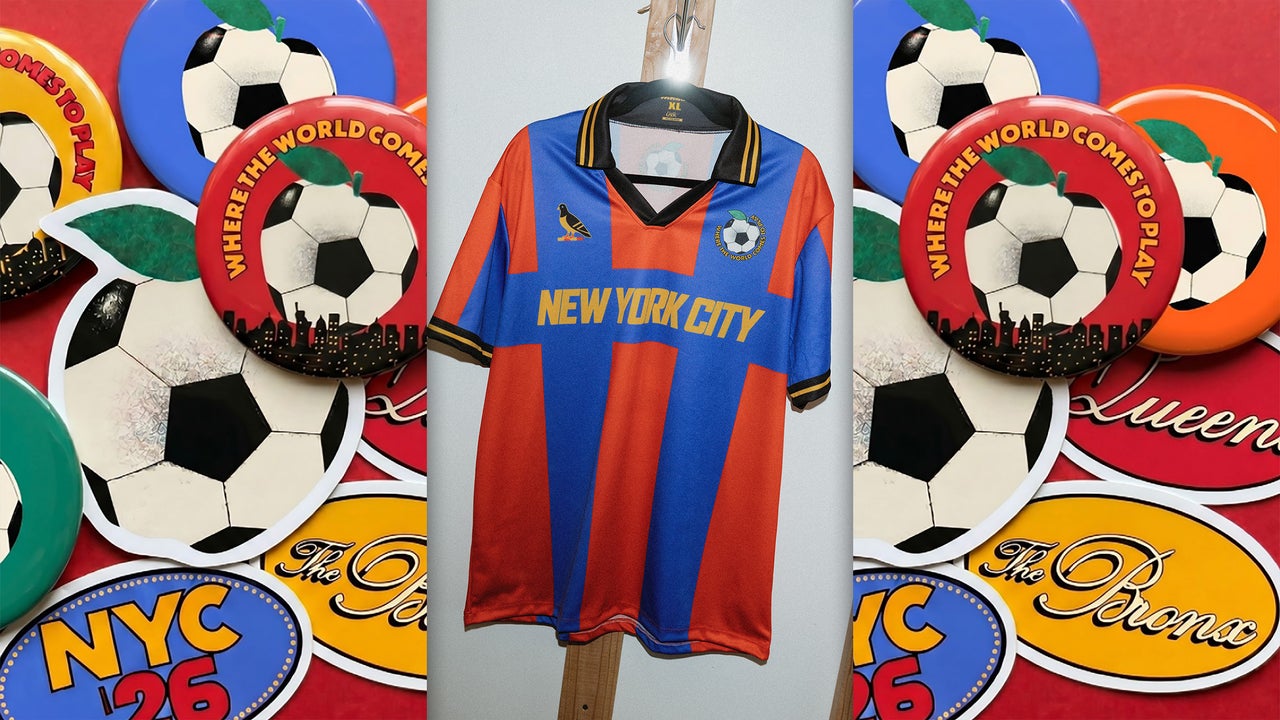
The campaign features bus shelter posters, subway signs, souvenir cups, and jerseys, all designed with a joyful, nostalgic, and vividly colored aesthetic. The overall strategy seeks to apply the positive aspects of sports fandom to New York City itself, rather than solely benefiting the tournament's organizing body.
Key elements of the campaign's visual language include an apple with a soccer ball-like skin, which serves as a central symbol, and graphics derived from the flags of the five boroughs. The design process involved extensive research, including examining the New York Public Library Picture Collection for nostalgic city street signage and sports memorabilia. The color palette draws inspiration from everyday city sights, such as subway green, red shopping bags, and yellow taxis.
Mayor Zohran Mamdani's office spearheaded the initiative, aiming to make New York more inclusive. The campaign builds on the slogan "Where the World Comes to Play," which was introduced by NYC Tourism + Conventions last fall. Related initiatives include free public watch parties, collaborations with family-owned restaurants, and public space improvements.
The campaign's broad reach, appearing on screens, streets, and merchandise, is intended to make residents feel involved in something larger. The jerseys, designed to be retro and accessible, are made in Brooklyn and feature borough symbols and a pigeon drawing, a suggestion from the Mayor.
According to Fast Company, the campaign represents the Mayor's Office's largest application of its refreshing approach to visual communication, serving as a potential model for how other cities might approach mega-event branding.
Advertisement
AdSense slot • inline


